|
See davidgauntlett.com for new stuff. |
 |
![]()
Popular Media
and Self-Identity: New approaches
Inaugural
lecture given by David Gauntlett at Bournemouth University, 2nd June 2004.
David Gauntlett, appointed as Professor of Media and Audiences at Bournemouth University in January 2003, delivered his Inaugural Lecture on 2 June 2004. The talk explains his work with 'new creative research methods' up to that date, outlining some of the philosophy behind it and discussing particular case studies.
Note that as time goes by, this lecture becomes increasingly 'historical'; since June 2004 we have developed new projects which you can read about elsewhere on this site.
The text below is a transcript, and therefore is in the style of a talk, rather than the style of an academic journal. To print it out, use the version for printing, which is optimised for printer output.
You can also view a streamed video of the event.
As always on the web, there is a compromise between file quality and download speed. The slides here are compressed so that all 62 of them add up to just 1.7 MB, which is quite slim. However, you may need to wait a minute for them all to load.
![]()
Welcome. Thank you for coming.

This is an inaugural lecture. Not everybody is born with the knowledge of what an inaugural lecture is, of course. I asked around and I looked it up in my dictionary. My dictionary, the one that sits beside my desk, says this: 'Marking a beginning,' which I thought was quite nice.
Since I arrived, as Roger said, fifteen or sixteen months ago, I feel that I have started to do something new and distinctive at Bournemouth. This lecture gives me an opportunity to set out that stall.
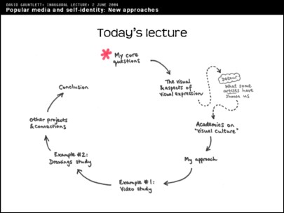
In today's lecture there's lots of stuff about visual things, so I've drawn a diagram. There'll be other diagrams too, and pictures. To start off, I'll tell you what my core interests are. We'll start with the basics. Then I'm going to talk about different aspects of visual expression. But then we have a detour, surprisingly early in the talk, where you'll find me talking about oil painters of the past and you'll be wondering what's going on. Bear with me, because quite soon after that we move round to me talking about my approaches and giving some examples, and talking about other connections that we've made. So, that's what's going to happen today.
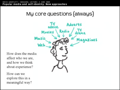
My core questions are always – [as seen on this slide]. There's some drawings in this talk, and I told my friend and sometime boss, Chris Wensley, that I was doing some drawings for this lecture and he turned slightly pale. That's support for one of my theses about the way in which people judge visual expression differently to verbal expression. If I had said I was writing down some stuff, that would be fine, it wouldn't matter if the stuff was rubbish because at least it's words. We start to become a bit more uncomfortable when people use more visual or personal forms of expression. So, forgive my drawing, but here we see a man – or woman, because I made it genderless – being affected, bombarded, by all the different kinds of media that we have today.
This is a standard thought that media academics have, that here we are as individual audiences and bombarded with lots of different messages from different media sources. And there are key questions about what we do with them. How do they affect who we are? How do we make use of the information that we get from the media? How does it impact upon our own experiences? These questions are quite normal in media studies. Then we've got the matter of how can we explore this in a more meaningful way than academics usually go about it. And so this...
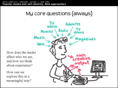
... is my extension of the standard diagram, where we look at people's own creative expressions as well. That doesn't mean that people need to be painters, or people who spend each day doing a little drawing; people's creative self-expression can just be through their speech, through their clothing and through all of the different ways that we express ourselves.
And, in the kind of research that I do, I actually get people making creative things in a way that's a bit unusual for them and pushing them a bit. But it's part of my standard view of the world that people are always being creative, are always creating expressions of themselves in different ways, putting stuff out into the world about who they are.
And this is bound to be affected, in some way, by the media. The media, I always think, affects how we see relationships a lot because when you start out in life, you don't know what happens when you're in a personal relationship: you've only got your relationships with your friends and family to go on. But we see an awful lot of that in the media. When people have their first personal intimate relationship, the only experience they've really got to go on is stuff they've read in books and stuff they've seen on films or TV. So I think that's just one area, of the many, where the media is bound to influence what we expect and what we get out of those experiences.
On the other hand, none of you think that the media makes us who we are. It's typical, in surveys, to find that people are worried about the power of the media or worried that the media is going to be affecting other people: the fear is that people will see things on particular TV shows or soaps or reality shows and this will affect them adversely.
But if you ask anybody if they feel that they, themselves, have been directly affected by anything in the media, they'll say 'Of course not, that's just ridiculous.' So there's some distinction there between what people assume is happening to other people and what people assume is happening to themselves. This is an area that I think is worth exploring.
So, I'll move on. My first segment is about the visual.
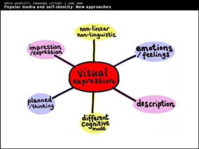
I've got a drawing here which is meant to plan out a few different areas of visual expression. They come in spheres which I've colour coded. On the one hand [pointing at diagram] visual expression can be used to just describe something quite straightforwardly, but on the opposite side of that [pointing at corresponding pink sphere], in this sphere, you can produce visual materials which are most expressive or create an impression about something, without being a diagram or something specific. Art is normally at that end, and the diagram which shows you how to use your kettle is normally at the other end.
Here, similarly [pointing to blue sphere], visual material can be used to express emotional feelings, or it can be used in a very planned and careful way to express clear thoughts.
And, furthermore, it's a particular and quite obvious thing about visual expression that you can put down lots of stuff in one go. When we use language, we always have to put things into a certain order because that's how sentences work. You have certain propositions which are put together with other connecting words. And certain ideas always have to come before other ideas, and the ones that come first seem to have a link or have a causal relationship with those that come second.
With visual expression you can put down lots of stuff at once. For example, as I've done here. You can see it all in one go. You don't have to read it in any particular order. So the non-linearity of visual expression is an aspect that interests me.
To illustrate that, we can move to a very messy complicated diagram which you probably can't make any sense of from there...
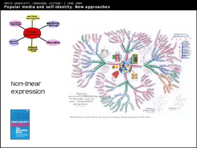
That's a 'mind map'. You've probably seen this kind of thing in bookshops, or books by Tony Buzan, who also does programmes on the BBC where he talks about mind mapping. And, on one hand I think it's quite interesting; but on the other hand it's one of those self-help kind of discourses that people are often quite queasy about. We don't want some guy on the TV telling us how to map out our thoughts in a diagram like that. As with other kinds of self-help, many people think they are getting on just fine without needing to read a book. The idea of a book having the answers to the complexities of life strikes people as mildly offensive. And here it's coupled with that kind of embarrassment about visual expression and drawing that I was talking about before. At the same time, I think this hostile reaction is quite interesting in itself.
[Turning back to the slide:] What this is, this is a mind map by Loraine Gill which summarizes a series of lectures on the creative process as seen from the perspective of a practicing artist, apparently. There's lots of stuff there. I mean she's planned it all out and this helps her to think about this series of lectures.
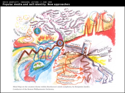
An even more complicated one here. It may just look like a blur from where you're sitting. This mind map is interesting because this was produced by Benjamin Zander who is a very distinguished conductor. He's been the conductor of the Boston Philharmonic Orchestra for 25 years. And the way he works is to really get into scores and take them apart, do lots of research about what the composer intended and what the original sources of the score were, and what the composer wanted to bring out in each of the movements. This diagram does actually break down into first, second, third and fourth movements. So there is some kind of order to it.
And, having done years of research, he then plans it out visually before he then takes it to the orchestra; he shows them this, and works with the orchestra to kind of bring out the different colours, forces and feelings that he has identified in the diagram. Obviously you need to study this diagram in a lot of depth to get at the true meanings. But there's lots of stuff there about the emotions that he's trying to bring out within the work and – I'm no expert, but music critics tell me that this creates a quite different interpretation of the work which is quite different to the standard way of performing the work. And that's aided by visual expression.
Let's move on with my set of images. We're starting off on the detour now, so I'm going to be showing you a few different visual things and you'll be confused about why I'm showing them to you. But eventually it will all fall together.
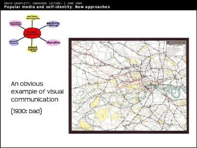
An obvious example of visual communication, that everybody knows about, is the London Underground map. A very well known, clear, diagram – because it's not actually a map – which everyone thinks is a blessing, and it helps us to get around London. I thought it would be interesting to see what they had before that, and what they had before that was this: [see slide above].
It's a mess. And interestingly this is the tube map that they had at the start of 1930's. And at the start of the 1930's the London Underground wasn't getting many new passengers; people found the experience of going on the tube rather confusing and disconcerting. The system was kind of stagnating a bit, and the company felt that something needed to be done. I think it's interesting that what they did was not to change anything about railways, or tracks, or platforms, or signalling. What they did was change the visual diagram. Arriving at this:
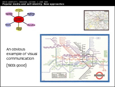
And suddenly people felt much more at home on the underground and the number of people travelling on the underground went up and they found it to be a much more pleasurable experience. Just because the diagram changed. The new diagram was done by a man called Harry Beck, and there's a whole book about how Harry Beck invented this diagram and struggled to introduce it, in the London Underground system.
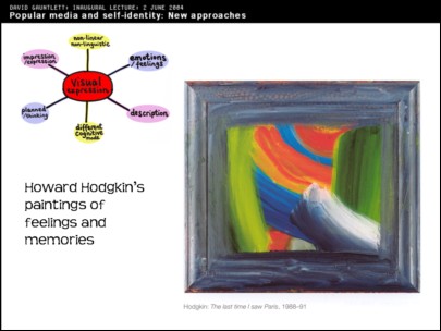
Next thing along, if we go back to my diagram, which is up in the corner, I've got a sphere that's about visual expression used to communicate emotions and feelings; and here as an example of that we have Howard Hodgkin's paintings. He's a painter who's in his sixties now – he's still alive. They're a clear example of paintings which are not representations of things, though he gives them titles.
This one for example is called 'The last time I saw Paris'. Now, if you were evaluating this painting in terms of whether you think it's a good painting of Paris, or whether it looks like the last time you saw Paris, you probably would say 'It's not doing very well. It's a bit of a blur.' It looks like he's taken his glasses off at the very least.
But all of the paintings that Hodgkins does are meant to be paintings of memories, or memories of feelings, more specifically. He says that 'I don't think you can have a successful work of art of any sort which doesn't contain the maximum amount of feeling'.
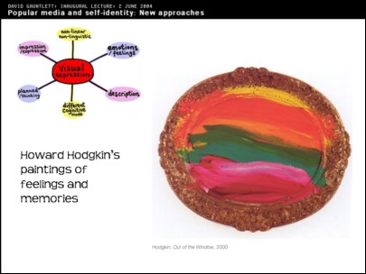
And clearly works like these, are full of feelings. You might be able to perceive how much feeling's gone into them. He spends absolutely years doing them and revises them and works over them until he feels he's got them just right. You might think that it's just a coloured splodge that you could have done of an afternoon. But he's invested a lot of feeling in it and I think, because he's successful and people do relate to his paintings well, or people do feel they connect with his paintings, that shows that he has actually been successful, even though he's bound to be subject to the standard criticisms that he doesn't have a really good artistic technique.
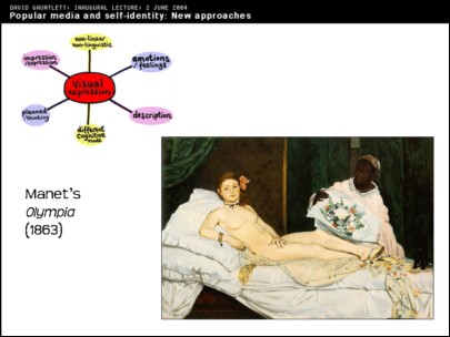
By contrast Manet had a pretty good figurative technique because you can clearly see what this is. This painting, 'Olympia', you may have seen before: it's seen today as one of the founding monuments of modern art. As an art history beginner, like I am, you kind of look at it and [what you see is that] it's a reclining nude. We all know from going to galleries in our schooldays, if not since, that galleries are full of reclining nudes and the history of art is full of reclining nudes.
So the interesting thing about the audience reaction to this – because I'm interested in audience, so the audience reaction is important to me – is that it was seen as shocking. People were appalled. This was in 1865, when it was exhibited in the Paris Salon.
I have a description from T J Clark who says that 'The crush of spectators was variously described as terrified, shocked, disgusted, moved to a kind of pity, and subject to epidemics of mad laughter'. Manet, himself, didn't even set out to shock. He was upset by this reaction. So it's an interesting situation.
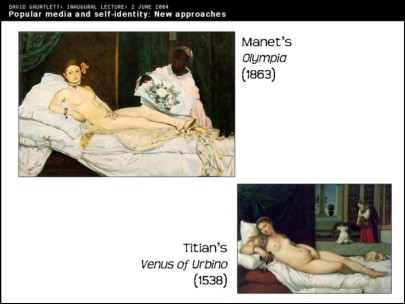
We can compare it with Titian's 'Venus of Urbino' which was a clear influence on Manet's work, as you can see from the similar kind of pose, and the painterly style is different. Titian is being more precise and it's more carefully painted. But 300 years have passed so that's not such a great surprise. And the audience were well used to seeing reclining nudes as I've said, so that doesn't explain the shock.
The shock is basically because modern life was being reflected for the first time. The audience – if paintings have an 'audience' – the audience in 1865, when Manet exhibited his work, could read the visual clues that told them that this was a painting of a prostitute. She's staring very directly at the viewer, not in the seductive way that Titian's kind of nude would be, but these are very subtle signals.
I think that's what I find is interesting. Very subtle visual signals, caused a massive difference in reaction. The difference being people at the time would have seen Titian's painting and gone 'Ahhh', and would have seen Manet's painting and apparently were weeping and fainting, which is quite extreme, and today seems strange. But that's just because of subtle differences in the visual codes that were being given off. And it's like that Manet, without meaning to upset people and partly in spite of himself, produced a painting which was too modern and revealed the world too well.
And I find it interesting personally to find painters pushing at the boundaries, as Manet was. I can't tell that really by looking at it. You need to read about art history. As I said, I'm a beginner. You've got painters pushing at the boundaries and asking society questions, challenging society in this way. When you've been to an ordinary English school, like what Roger said I had and had an ordinary education, you find it quite surprising to find that painters were doing this and I find it quite nice. I do paintings myself but I don't ever manage to achieve the weeping or the fainting.
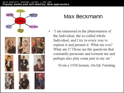
Next along, another painter, on my painterly detour: Max Beckmann. I find Beckmann interesting because, for one thing, through his painting career, he painted himself in many different poses, as different things. He painted himself in numerous pictures as a clown or a prisoner or a sailor. He wasn't any of those things, but he painted himself as different things like that, trying out different roles. And it's because he was searching for something about himself.
If we look at this quote from him – he says:
'I am immersed in the phenomenon of the Individual, the so-called whole Individual, and I try in every way to explain it and present it. What are you? What am I? Those are the questions that constantly persecute and torment me and perhaps also play some part in my art'. I think they clearly played a big role in his art.
A strange thing for me is that I read this quote and it's from Beckmann in 1938 and it reminds me very strongly of a quote by the sociologist Anthony Giddens that often shows up in my lectures, from a book called Modernity and Self-Identity which was published in 1991, over 50 years later. That quote, which is about people struggling to find meaning in society and which I connect to how they use the media in society, goes:
'What to do? How to act? Who to be? These are focal questions for everyone living in circumstances of late modernity – and ones which, on some level or another, all of us answer, either discursively or through day-to-day social behaviour.'
Everyone has to answer that question about who we are in modern society. But then I find it interesting, as I explore the visual more, that Max Beckmann, a German painter, 50 years earlier, was exploring exactly those issues – through paint. They're the same issues that Anthony Giddens says we're all exploring in modern life, but this is much earlier, and it's done in painting. I find that interesting.
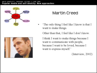
But then to bring it into the modern day, here is Martin Creed, who won the Turner Prize in 2001. Well known in this country for being the guy that did the work 'The Lights Going On and Off', which everyone was pretty disgusted by because it seemed that he'd taken over the largest gallery in the Tate and had the lights going on and off, as the work's title suggested. The standard interpretation of this was that he was just a strange minimalist who couldn't think of anything else to do, and did that, presumably. And he got rewarded by the 'establishment', and people were horrified by that. Taxi drivers would not think kindly of Martin Creed, I fancy.
But actually if you read interviews with Martin Creed it's very interesting. He started off as a painter and was producing paintings and, as far as one can tell, they were perfectly good paintings. But then, at one point, he decided to stop painting and just to think about what it was he was doing, because he was having to make choices, to paint something and decide what to do next. And he decided that he wouldn't decide what to do next, instead he'd take a step back and think about it.
So then he started doing much more simple work, such as 'Half the Air in a Given Space', which was a room half-filled with balloons. He doesn't want to be putting much more new into the world, because he feels the world has got enough in it already. So he doesn't want to be putting in new stuff, which I think is quite nice and quite thought-provoking. He doesn't feel the need to put new stuff in unless he thinks it's worthwhile or interesting. Instead he makes use of things that might otherwise already be happening, such as 'A Door Opening and Closing' which is based on a door opening and closing.
So he still feels that the work comes from the same place as his need to make paintings, but he decided not to do paintings and to make other things. The quote there is 'The only thing I feel like I know is that I want to make things. Other than that, I feel like I don't know' – and he's got a massive uncertainty in all of his work, not wanting to go too far or make things that are going to be a waste of time. But he does say: 'I think I want to make things because I want to communicate with people, because I want to be loved, because I want to express myself.'
And I keep saying things are 'nice', but I think it's quite nice to find that sort of the most extreme kind of conceptual artist that you could think of (possibly) ends up being someone who just wants to communicate something about himself ultimately. And I don't think he's being disingenuous or just trying to make himself sound like a nice guy when he says this. I think this is where his artistic work comes from.
So I've brought us up to the present day. I've said some things about personal expression and about art work. But you're probably wondering how this all fits in to what I do as somebody in the Media School. So we can move on.
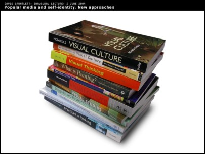
Now we're back from the detour. We're back to this, about Visual Culture studies. Here's a pile of books about visual culture. There's lots of them. There's a new kind of academic industry called Visual Culture and there's a problem with it which I've summarized in this drawing here:
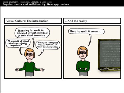
Visual Studies, if you look at the books, what they always emphasise are these things. One: that meanings are made in the minds of individuals in their encounter with whatever work it is. So, in other words, the meaning of an artwork or the meaning of a TV show, the meaning of a film, is something that is formed in your own mind as you encounter it. Fair enough. We agree with that.
Second point they always make is that all aspects of digital culture are equally important. So that's nice. And the third point is that everyone interprets visual material in their own unique way. So you couldn't have a book telling you how to read a particular film or TV show or artwork because it's always individual and it's always in your own mind. So that's fine.
And they always say that in the 'Introduction' within each of these books about visual culture. But then you flick on [in the book]. Basically they write these introductions, saying these nice things –very democratic, very open – but then they've got to fill the other chapters so they normally end up telling you how to read a work. Like that [points to the second frame of the drawing]. So basically you get the book that says that stuff in the introduction [points to the first frame], but then in the other chapters it tells you to read a painting in this way, to read a film in this way, to read a TV show by using these particular methodologies which we're going to usefully set out for you.
So in that pile of books that I had on the previous slide there's a book called An Introduction to Visual Culture [Nicholas Mirzoeff] which does that. There's one called Visual Methodologies [Gillian Rose] which does that. There's a book called Practices of Looking [Sturken & Cartwright] which does that. They all do the same thing and they end up telling you how to read a work. They say that nice thing at the start about how it's in your own mind, but they don't entirely seem to mean it.
This leads into my own approach, because I do particularly value what's in people's own minds. I don't want to tell anybody how to read a particular film or read a particular TV show, because I don't think that's my place. I need to find out what those works mean to the individuals that consume them. That is maybe my place. So we move on to look at the methods that I've been developing.
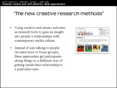
Mostly the kind of work that I do is about using creative and artistic methods to explore people's relationship with media culture. What that means is, instead of just getting people to tell you how they relate to a work – in interviews or focus groups, using language, which is what is normally done – instead you get people making things as a way of exploring their relationship with that visual media world. It does work, but I was taking a chance when I first thought about it.
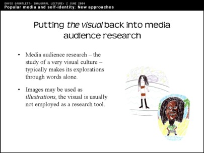
Media audience research typically – this is the critical bit – uses words to explore visual culture. Which I don't think entirely makes sense. Normally to explore people's relationship to the media – which, as we know, is very visual, very much all around us, with lots of images – researchers normally get people in a room, sit them down and ask them about their relationship to the characters on 'EastEnders' or whatever. They make it much more specific [to particular media forms]. They make it much more language based. People have to explain in words, instantly, how they relate to certain media things. And that's not easy. Images in media studies are quite often used as illustrations, or we might show video clips in lectures, but the actual making of images doesn't normally form any part of media studies.
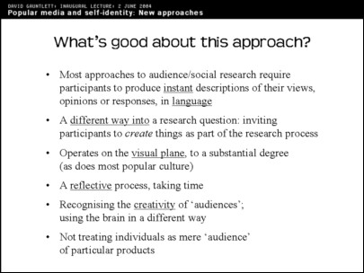
This is a particular wordy slide, I'm sorry, but it tells me all my key points. The good thing about this approach is, as I've already said, most approaches normally ask people to provide instant descriptions of their responses to particular kinds of media, using language. That's not easy. It can't always be assumed to work.
My approach is a different way into it. It's not necessarily better. Asking people to explain their feelings about things in language is often good and you get their gut reactions, or what they say when you ask them a question – you get their response. That's often useful. But it's not the only way to explore these things.
Instead the kind of work I do operates on the visual plane which, as I've said, is the same plane that much of the media is operating in. So that's good: you've got a match.
Often it's a reflective process, taking time; because if you ask people to make a creative work they have to think about what they're going to do, then they do it. Then you ask them to reflect on it (so ultimately it does come back to language again); you can explore what they've done with them. But they've had that creative process first.
So that's something which takes time. It's different to when I ask you a standard interview question, like 'What do you think about such-and-such a celebrity?', people have to tell me using words. This is different. It's a more thoughtful, reflective process and even the act of creation, I think, makes a difference: if you are asked to do a drawing as part of a research process, then you kind of have to make particular shapes and movements with your arms, and your body, to make a drawing. It kind of comes through your body, in a different way to if you're just speaking using your brain and your standard linguistic functions, I think. It doesn't necessarily reveal more, but maybe it can do.
This approach recognizes the creativity of audiences, and you're using your brain in a different way as well. If you're asked to do a creative visual task then it uses different parts of the brain. I'm going to say a bit more that later.
Also this kind of approach tends not – it can do – but it tends not to treat people as 'audience' of particular things. A standard approach in media studies is to see people as the audience of a particular thing. Women are the audience of women's magazines, certain people are the audience of 'Big Brother', or whatever. Whereas my kind of approach tends to see people as being individuals who are influenced by lots of different bits of the media which come at them at all times and which then have to be assimilated by their brains into different kinds of response. So it's not seeing people as a specific, particular audience of a specific, particular bit of media. It's seeing them more as people who exist in a media filled society.
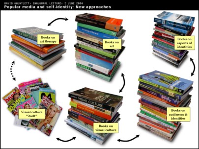
Here's some more piles of books. This is about how the approach that I take hopefully links together different bodies of information, and how I've had to look at different disciplines, or different disciplinary areas, and try to make connections between them. You've got your standard books about visual culture over here. They are connected to, but different from, books that are specifically about visual art. Then those ones connect over to the books art therapy. I spent a lot of time reading books about art therapy and only came up with a conclusion which can be summarized in one sentence. That sentence is coming up. I'll tell you a bit about it first though.
I found that in art therapy, unsurprisingly, there's different schools of thought about how art therapy should be done. But one key thought was that drawings can be 'read' like dreams, in the way that psychotherapists 'read' people's dreams. It was thought that psychotherapists could look at people's artworks and interpret them in the same kind of way. So you'd be looking for particular signs and symbols, and assuming that this told you about the psyche of the person that had drawn the picture.
Also in the 1960's to 1980's, there was a kind of method where you asked people to draw particular things, such as the 'House–Tree–Person' test, where you asked a person to draw a house, a tree and a person and then you had a fairly long and complicated chart that would enable you to diagnose what was wrong with them just by looking at how they'd drawn the house or the tree or the person. If you'd drawn a person with too many arms that possibly would mean one thing. If you'd drawn a house with a particularly large chimney that would mean another thing. If you'd drawn a house with no doors that would indicate an unwillingness to communicate, and so on, and you could get your psychotherapeutic handbook that would tell you what was wrong with the person by looking at their drawing.
Unsurprisingly this came to be seen as being rather simplistic, and fell by the wayside. These days – and this is the sentence which summarises what I learned – art therapists do their work by encouraging people to do drawings, but then talking with them about the drawing. So instead of the therapist interpreting the drawing, you get the person themselves to interpret their drawing, which makes much more sense. In the old style, you had so-called experts imposing an interpretation of what had been drawn. We don't really like that, that imposition. Instead you get the person that's done the drawing to interpret it themselves, and then you have a sort of process of discussion between the so-called expert and the artist themselves, and something fruitful comes out of that. So that's what I learnt from art therapy really, which was useful for the methodology that I use.
The different academic material connects into visual culture itself, which I tried to photograph with a few magazines and stuff, over here. The books on visual culture aren't simply to do with media audiences but they're very much connected with them. These connections basically aren't normally made and you find this material in separate sections of libraries and separate sections of bookshops and separate university departments. But they're all part of the same kind of thing. So books that are about audiences and identities are very much about our existence in today's visual culture but they're different to the visual culture books. I don't need to go into the detail of it here.
Then you get much more specific books about aspects of identities such as the fact that all of these books [pointing to pile], they're all books about masculinities, and there's many more of course. So you've got the whole question of masculinity and how that feeds into people's sense of identity. It doesn't have to be masculinity it could be any other aspect of identity. It could be your ethnic identity or femininity or a wide range of other kinds of identity.
So I was trying to stir up all of these things basically. If we had a special blender button on this display, so I could spin it all around and mix it up, that's basically what I wanted to do, and make some new connections.
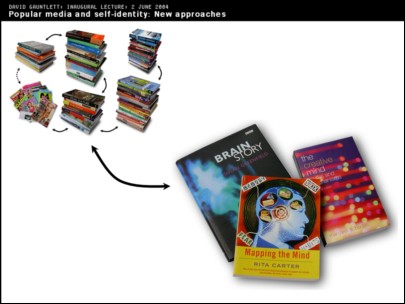
You can also connect all of this material with all of the literature about the brain and perception and how that works, because that's clearly a part of it as well. It's very simplistically represented here with a few popular brain-science books.
If we're looking at how people connect with visual culture, here is a totally different approach which is about how the brain perceives images and what the brain does with them, which is done by neuro-scientists as opposed to sociologists, and obviously they're speaking quite different languages. But it's interesting to put those two things together. You've also got the language about visual perception by artists and the discourse around that within art history, and sometimes that's actually more similar to neuro-science than it is to what sociologists say, I think. So, I'm trying to mix up all those things.
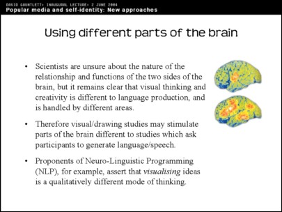
What we learn by looking at brain science is that it's very complicated. Scientists once thought that there might be a specific part of the brain for language, another part for visual perception, another perhaps for creativity. But now we know it's not that straightforward.
However what I have been able to establish, I think, is that if you get people doing creative visual tasks, it does spark off different bits of the brain compared to if you give them a task which is producing language, i.e. if you interview them about their media use, you're setting them a language task. That's different to if you ask them to do drawings or collages or video making or other artistic things.
Another point that's on [this slide] is that the proponents of Neuro-Linguistic Programming (NLP) – that's another kind of self help discourse that I'm not an expert on – but they're very keen on visualizing, and emphasise that visualising a problem is a qualitatively different way of thinking about it compared to other forms of thinking.
Also there are accounts of how geniuses of the past have been visual thinkers in unusual ways. Einstein, and Disney, and Da Vinci, and Mozart, were all visual thinkers for whom mentally picturing their creative works – whether inventions, or cartoon stories, or pieces of music – was the most important starting point of their creative process.
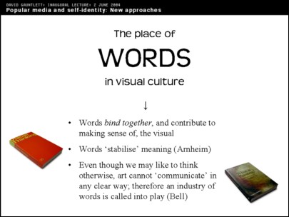
So, then we've got the question of the place of words in visual culture. I may get very enthusiastic about the visual world, I still work as an academic, I give lectures, I write articles; words are clearly important to me. And words are clearly important everywhere else.
I considered illustrating this by bringing in a copy of Hello magazine and taking the staples out. The staples being pretty much like the words: they're the thing that bind it together. If you've got a copy of Hello magazine with the staples taken out, well then, it's not bad, you can look at it. It's fine, but a bit unsatisfactory. If you got it from the shop like that, you wouldn't really want it, you'd prefer one with the staples in. And the words perform the same role in Hello magazine, I would say. If I give you a copy of Hello magazine without the words in, it would be alright. It wouldn't be as good as one that had the words in, but it wouldn't make that much difference. Same with the staples, the words help to bind it together, but they're not the most important thing. Hello magazine without the pictures, though,wouldn't be worth it. You'd be storming straight back to WHSmiths [newsagents], whereas without the words or the staples, you wouldn't maybe mind so much.
So words bind together the way we think about the visual world, and we use words to think and to communicate. Words are clearly important, and I don't want to do down words or language. But I want to bring the visual into what we do in media studies more I suppose.
Rudolph Arnheim – I like him – in that book called 'Visual Thinking' that we see here, says that words 'stabilize' meaning, which I think is quite good. In other words, in the interpretation of any particular visual or artistic thing, then, once people have managed to explain it or set it down in words, then it brings stability and consensus.
Julian Bell in another very good book called 'What is Painting?', talks about how art can't communicate in any straightforward way. People talk a lot about how artists express themselves and how they communicate. But it's not in any way that can be pinned down and when painting was first seen as being a medium of self expression, about 200 years ago, and ever since then, parallel to that has sprung up an industry of people trying to pin that down in words and to clarify and explain by putting things into words. To stabilize the market, he says, as much as anything else.
If you didn't have experts using words to explain the art works, well then you'd be all at sea. Maybe in a nice way. But it makes us feel uncomfortable, so we pin it all down using words.
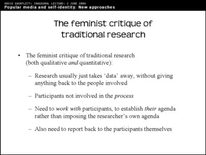
The feminist critique of traditional research also influenced me in my early days and, if you look at this, or as I explain it, you'll find that in fact it's not feminist in any gender sense. It's just about being nice basically, which feminists were keen on. No doubt still are.
They had this critique of traditional research which was particularly striking in the early '90s (when I was looking at it). They made this point that research usually just takes data away. You've got researchers that go into a school, or they stop people in the street. They get data off people, information about how they feel about an issue, and then they say 'Thanks', and they leave, and that's it. So it's not a process between the explorers and the explored, as it were. It's not any real kind of interaction. It's not any real kind of dialogue. It's just that researchers come in, take something, and go away again. So the participants are not involved in the process.
The feminists emphasised that you should work with your participants, to establish what their agenda is, rather than turning up with your own agenda and saying 'Hello, do you agree with this, this and this.' Instead you should meet with these people and find out what the key issues are as far as they are concerned.
So, that gets us to the kind of research that I find myself doing now. In fact my first example of the two examples I'm going to talk about was my PhD. So that's back in the 1990s.
What I was meant to be doing for my PhD was seeing whether all the 'green' and environmental messages in the media had made today's kids more green and environmental. That was the question. The trouble was, this is basically a kind of media effects question: Had the stuff the children had seen made them more green? So I had to explore all of the literature about media effects, and found that it was problematic to say the least.
Most of it was about media violence and it was about American would-be 'scientists' trying to prove that there was a direct link between having seen certain things in the media and people going away and being violent. It was simplistic and many of the studies were badly done. I didn't get very far with that although I did write a book that said that all those studies were rubbish. But then I had to go back to my PhD and realised that I'd just said that effects studies were rubbish, and I seemed to be doing one. So that was a problem.
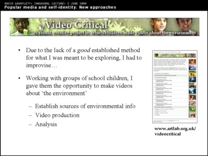
So instead I had to do something else. Due to the lack, as says here [on the slide], of a good established method for doing what I was meant to be doing, I had to do something else. So I went into Leeds schools (because I was in Leeds at the time), with video cameras, and worked with young children aged between seven and eleven, to make videos about the environment. And I thought, through the process of them making videos about the environment, we might learn something about the messages that they'd received from the media and what they were able to do with those messages.
So first of all I had to establish where they got environmental information from, and what I found (happily, for these purposes) was that most of it did come from the media, because that wasn't a topic that they were hearing about much in everyday life otherwise. Then we made the videos which took time, over several weeks with each group, and there were seven different groups making videos. And then you've got the analysis stage where I'm meant to be the academic expert and tell you what it all means at the end of it. But in fact it was more of a dialogue than that.
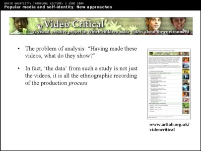
Having made all the videos, you've got the question of 'What do they show?'. But in fact it's not exactly about that, because the 'data' that I had gathered whilst doing this study was not just seven edited videos. What I got was all of the observation of the process of making the videos, working with groups of children who I met with, talked about what they knew about the environment, what they were concerned about, going out, making a video, then planning what to put into the video, planning the story, the narrative of the video and also you've got the narrative of them making the video, as observed by me. And all of that process is the most interesting data. Also you've got some videos at the end which you can study.
Just to give you a taste of some of the videos – I'm not going to show you any of the actual videos because they range from about 10 to 20 minutes each, but here we've got just three screen shots from each one.
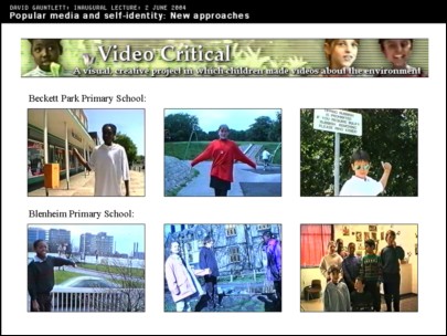
So this is the children of Beckett Park Primary School. At Beckett Park they were quite dictatorial and authoritarian. They were always instructing people on how to behave – here Izoduwa is squeezing a can that she's then going to put into the bin. She's showing you how to do that. And there's a boy, Chris, pointing to a sign and telling you that you should do what it says.
At Blenheim Primary School they were a bit more laid back. They also went on a tour of their area: most of the groups chose to do a tour of their area. At Blenheim they chose to write a letter to the Council, and the video includes this story of them looking at a waste site that's next to their school, being disappointed that it's not used for anything, and writing to the Council about that. You see Chabu going to the school office and phoning up Leeds City Council and asking to speak to somebody and getting their address, and then the children write letters. And then they get a letter back from the Council which responds to their concerns. And all this story plays out in the video. Ultimately they received no satisfaction but at least they'd had a chance to air their views.
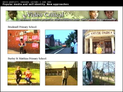
At Brudenell Primary School, again, that was a tour of the area basically. On the left you've got Vinesh, the world's smallest boy, who was just lovely and stands in front of those posters going 'Why have they made a mess of this area?'.
And this one at Burley St Matthias, again it was a tour of the area. They interviewed some people as you can see happening there.
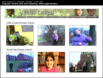
The group at Little London were the youngest group, all seven year olds, who still made some very interesting points about the environment. In particular, Miriam, sitting there on the top left, she's holding a plant to show her closeness to nature, and she's talking there about the 'everywhereness' of the environment and how, when you go out into the world – she's talking in a sing-song kind of way, and she's saying – 'When you go out into the playground, into the streets, the environment is everywhere. You've got to care for it.' And she talks about this for about 75 seconds, which is quite long.
And Royal Park Primary School, again, it's a tour of the area.
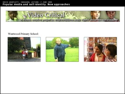
And this one, Weetwood, was also a tour of the area: they interviewed people, they went into shops. They reprimanded shopkeepers and restauranteurs for not recycling properly. And so on.
I had to edit the videos. I did that. But I edited the videos together by asking the children what kind of story they felt that their production was telling, and then edited it according to that. Normally the editing was quite obvious and straightforward; it was clear what I was meant to be doing. So I don't feel I imposed too much, but it's potentially a problem that I edited the stuff afterwards. I could have imposed some other story on to it, rather than the story that they wanted to tell. I don't think I did. I think I respected the story that the participants wanted to tell – but you could always argue with me.
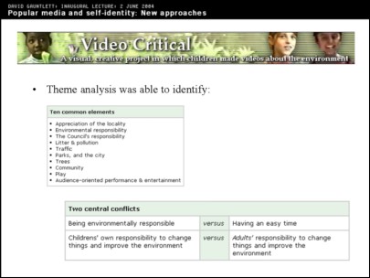
So then there's different ways that you can analyse videos like this. I did a theme analysis which identified certain things that always came up [see slide]. These came up in all of the videos. Nothing to do with me because I just trailed round after the kids going 'Don't break that camera!' mostly.
There were two central conflicts which seemed to come out in all of the videos. There's the one about being environmentally responsible, which they all felt was important, versus having an easy time, which they also thought was a good idea.
And the conflict between children's responsibility to change things and adults' responsibility to change things. On the one hand they were always saying 'Change the world, it's up to you,' and things like that. On the other hand they were always wanting to phone the Council, or write a letter to the Council, because the Council was seen as responsible for most things.
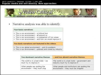
And if you analyse the narrative, you could find that four narratives typically showed up: it was normally one of those four. But you can look for what absences and silences there are in the videos, and find that two basic narratives not featured in the videos were 'This is our global environment and its problems,' and 'This is our environment – polluted and ruined by industry'. They never blamed industry or the Government, primarily (I say) because TV and the media never blamed industry and the Government. Children's TV and the media always made it an issue about picking up litter and recycling and local stuff, and children followed that agenda. Not in a blind or stupid way, but just because nobody had told them any other agenda.
Similarly you've got the two dominant narratives there: 'The world is in a bad state – we must try to improve it,' and 'Other people are spoiling the environment – they must stop'. And they didn't have narratives such as 'The world is in a bad state – government and industry must try to improve it,' or 'Other people and institutions are spoiling the environment – they must be stopped'.
But really the study isn't just about stuff that can be summarized in tables so maybe I shouldn't even bother doing that at all. It's not just about the media messages received or not received. It's also about this whole thing of what they did with the messages, what they were able to do with the messages, what they were able to do with information which they got from different sources about the environment and how they felt and how they were able to express this in a creative way in the videos.
They were clearly very media literate. Even the children as young as seven did quite satirical videos which spoofed the styles of TV shows that they'd seen. And you could see them really sort of working through the issues and being creative media producers themselves. Which is not something that people often get the opportunity to demonstrate in a media studies study. Normally people are positioned as audiences and they have to give their responses. Here they are able to be more creative and expressive. And when they had the opportunity to do that, they were able to do something interesting.
The kind of studies that I like least, I suppose, are those that just position people as victims of the media, or people who can only respond in a particular way to what they've seen. So when American 'scientists' are setting people up in a particular way so that they can measure one particular response, it seems to not give the participants any opportunity to express themselves in a different way or to say that they don't think 'this', in fact, they think 'that', and to step outside the box. So I like approaches that allow people to step outside the box.
Example number two, which I was helped with by Chris Thompson who is here today, is where I went into schools, trying out an idea about getting people to do drawings instead of talking, as their response to the media.
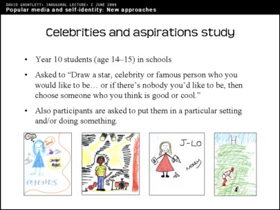
This was with Year 10 students, aged 14-15. They were asked to draw a star or celebrity who they would like to be. If they woke up in the morning and they couldn't be themselves – if they wanted to be themselves, that was nice, but if they couldn't be themselves – if they had to be a star or celebrity instead, who would that be? And they had to draw that person and also put them in a particular setting.
Here, for example, you've got Jennifer Aniston. She's thinking 'I love Brad' – the women were often positioned thinking of their superstar boyfriend. Bob Marley, surprisingly enough, came up quite a few times, about five times out of a hundred. J-Lo there with her money: quite an incisive critique of the J-Lo problem I think; and Johnny Wilkinson, the rugby player. These are just four of the many pictures that were produced.
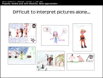
It's difficult to interpret pictures alone, as I've already said. If you've just got the pictures... Here, for example, you've got Rachel Stephens; Cameron Diaz; Jordan; Ali G; Hugh Heffner, surprisingly – I think there must have been a TV special about him recently or something; and Kewell who is a football player.
If you've just got these pictures, it's very hard to know what to do with them. I could impose certain interpretations. I could say well obviously this person has been drawn in this position, this size and using these colours, in this setting, because the artist obviously idolizes these certain aspects... But I wouldn't know if what I was saying was right, or if it had anything to do with what the person was thinking when they drew the picture, and it would be strange to try to impose my own interpretation on it.
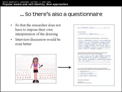
So I did a questionnaire. It would be better to do talking, [interviews], I have to admit, but because I was going into classes and teachers would always say 'Can you do the whole class?', well then you have to do 30 all in one go. So it had to be a questionnaire really. And I asked why they would like to be that person, and another question about the setting. But the most interesting one turned out to be a kind of throwaway questionnaire question which I put on at the end...
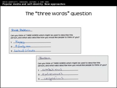
... which is the 'three words' question, which says: 'Can you think of three words which might be used to describe this person and which would also describe how you would like people to think of you?'. I tried to put it into simpler words but I couldn't.
David Beckham, for example, was described as 'happy', 'a family man' and having 'lots of friends'. I think that's quite nice. (This was before the Beckham affair allegations earlier this year). It doesn't contain anything about soccer skills you will notice, and it's got him in his family/father role, which is quite interesting for a 14/15 year old boy I think. It shows that they're thinking about stars in slightly different ways to the kind of stereotypical way that you might think people were thinking about stars.
These are just typical examples. Jordan, the glamour model, is described as 'ambitious', 'extrovert' and 'ingenious', and I think adjectives like that are quite interesting. People don't typically think of Jordan as being ingenious in particular, it's probably fair to say. But I talked to the girl who had done it and she did think Jordan was ingenious, because she'd used her skills – which this girl, herself, did seem to think were quite limited skills – but she'd used her skills in a way to make lots of money and to be successful and to be in the public eye – but in particular to make lots of money – and this was seen as ingenious. Which is fair enough.
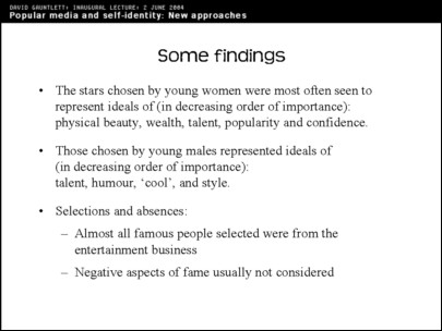
So this gave us some way of understanding, or looking at, people's connections with stars. I ended up quantifying some of it. So if you looked at the three words question and found the words that came up the most, or the kinds of phrases that came up most, for young women physical beauty and wealth were definitely top of the list. More than 50 or 60 per cent of girls said 'beauty', 'pretty', 'attractive' type words, and having lots of money, and also talent, popularity and confidence. With 'confidence', that was quite interesting: girls looking to other women as role models in that sense.
Young men picked talent most of all, and humour – 'having a laugh', those were the top two by a mile. Also being 'cool' and stylish. Nothing about being handsome. And funnily enough very little about having lots of money, whereas the women often went for the lots of money thing. I wasn't doing this study to make dodgy sexist claims about supposed differences between men and women; but these patterns are curious.
There are explanations for this, of course, and it's in particular to do with what young men and young women are willing to express to each other in the classroom setting. It doesn't necessarily give you a direct insight into what they actually think. It's about what their performance is going to be in the classroom.
So things that they often didn't seem to think, things that didn't seem to come up, included the fact that almost all of the famous people selected were from the entertainment business, obvious 'celebs', as it were, not famous writers, composers, film makers, anything like that. There were some sports stars, and musicians. But often just your straightforward 'celeb'. And the negative aspects of fame didn't really seem to come into the equation at all. Most young people seemed to assume that being famous would just be fantastic.
So [to recap –] I did this study; I got the drawings, I did the questionnaires with the three words which, funnily enough, seemed to be the most useful thing.
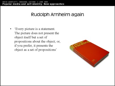
And then I was looking at Rudolph Arnheim again recently and found this quote, which I thought was quite thought provoking and I'm still working on this in my mind.
He says 'Every picture is a statement. The picture does not present the object itself ' – of course, because it's not the object itself, it's always a picture of it – 'but a set of propositions about the object; or, if you prefer, it presents the object as a set of propositions'.
So you could look at every drawing that's been done by a school child as being a set of propositions about that star, or a set of propositions about what it would be nice to be. That's still difficult to actually do, but it gives me something to think about.
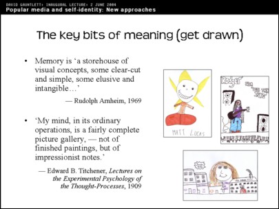
And he talks also about 'visual hints and flashes'. He talks about how our memories and the visual material in our brains are not a fully formed set of photographic pictures. As Edward Titchener says [on this slide], 'My mind, in its ordinary operations, is a fairly complete picture gallery, – not of finished paintings, but of impressionist notes.'
And the pictures that we have in our minds are not normally very clear straightforward pictures that we can just bring up. You've got sort of hints of things, or aspects of things, in your mind whenever you think about a particular thing. Such as when you think about a particular media star, there are certain hints and flashes, things that spring out in your mind about them, which is kind of impressionistic and not just a picture of them, but more like a picture of what they mean to you at the same time, I would have thought.
So I've tried to apply that here. This is just three pictures I picked out at random again. Matt Lucas, as pictured by this person and then drawn, clearly was someone that made this person feel happy and that's also what he happened to say in his questionnaire, when I looked at it afterwards. But it's pretty obvious from the drawing: it's just a picture of happiness and comedy.
Roger from Less Than Jake is drawn as kind of slumped and cool. You can just see from the picture, can't you, he's got that kind slumped, 'cool' kind of look, which is obviously the main visual thing that comes through for that person there.
And Jennifer Aniston, of whom there were many pictures, normally surrounded by shops and money, is here seen surrounded by shops and money. Obviously that's the kind of primary thing that was springing out in that person's mind when they drew it.
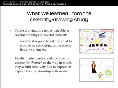
So what I learnt from doing this drawing study One thing was that having single drawings probably isn't that good. It's probably better to have a sequence of drawings or set of drawings, partly because media stars (or if it was any other subject it would be the same) don't just mean one thing. It would be quite nice to have a set of drawings of the different meanings that that person has for the artist. And then you could ask the participant to kind of put together a story or a narrative explaining those elements.
And also participants maybe should be able to choose for themselves the way in which they want to express themselves in a study like this. It shouldn't be me saying 'Here's the video camera' or 'Here's the pen.' It would be even better if you could step back even further and allow them to choose the method by which they would like to express or explain their connection with whatever question it is that we are exploring.
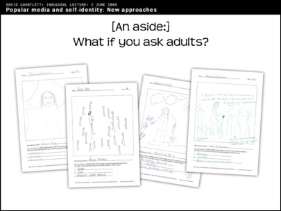
As a complete aside, I tried doing the celebrity-drawing activity with adults. I did a talk to the Graduate School recently, mostly middle-aged PhD students, and I thought, well, let's see what happens if you ask adults to do this drawing thing. The simple answer is that they were horrified. They didn't really take to it, it's fair to say. Half of them just didn't do it.
I'd handed out the paper and pens and I was saying, 'Go on, give it a go. It doesn't matter, it doesn't need to be a masterpiece,' and so on. 'Please do have a try'. But half of them just sat there and did not do it. Some of the other ones did it but they would not put their names on. They would half do it. They didn't really want you to see what they'd done, which then seems a bit pointless. These are the four that I'm allowed to show you (!).
You've got Diana Rigg; then Nelson Mandela, I like that picture where Nelson Mandela clearly stands out, with a halo over his head, surrounded by other happy people. Quite a nice visual expression of the spirit of Nelson Mandela as we imagine him, I think. And two TV gardeners, the one on the right being Alan Titchmarsh.
So the basic point is the reluctance, the way that adults just fear having to do that kind of schooly kind of thing of doing a drawing and having to show it to other people. It is embarrassing. And I thought I'd better do it, so that I'm in the same boat as these people. And I was very embarrassed about my drawing of Clark Kent's dad from Smallville – Jonathan Kent, I suppose, is his name. It was a very bad drawing which looked much too much like Bart Simpson. I thought it looked like Bart Simpson, and then somebody walked by and said 'You've done Bart Simpson'. So I was embarrassed showing my drawing to people too.
It's curious that we have that level of embarrassment about drawings. It's because it's something that we're not used to doing in everyday life these days. Once you leave school, most people aren't used to doing drawings, paintings, other visual things. Which is probably a shame. There's a national campaign for drawing that wants people to do drawings every day. Indeed I've got a pad and I'm trying to draw something every day at the moment, just to get better at drawing because I was so humiliated with the whole Jonathan Kent thing. But it's a nice thing to do, and you get a visual diary as well.
To move on: other projects. (I'm getting towards the end now, don't worry). I can just run through some other projects which have used these similar kind of methods in different ways. Often these are in their infancy.
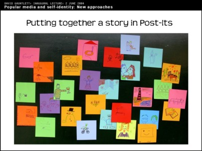
As I said, perhaps doing one drawing is too simple and too singular, wouldn't it be good to have a thing where you get people telling stories in Post-It notes. You can put together lots of different drawings, arrange them, you can ask people to put down stuff that's meaningful to them. It can be about a particular question about stuff that's meaningful from a particular genre of the media. Or it could be much broader. It could be much more autobiographical.
Post-It notes come in lots of nice coloured squares these days. So you can do the drawings and then you can arrange them and cluster together things that are meaningful together, and use that as a method. I'm just starting to explore that one.
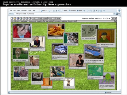
But then technology came along and my colleague, Jonathan Wardle, and I are preparing a funding bid for a project where we use people's mobile phone cameras, you know, mobile phones increasingly have cameras these days in them, and this is a project where young people are asked to take photographs that are meaningful to them, things from their home, things that they're connected to, things that they have an emotional connection with and then they upload them to a website and then you can arrange the pictures with little comments on. This is just an example online collage.
So this is a way in which young people can express things that they feel close to, and put them together in an online environment. And then the online environment tells them connections between themselves and all of the other people that are in the online environment and the things that they've taken photographs of.
So it's a way of getting people to reflect on diversity on the one hand, but in particular to think about the ways in which they're connected with other people too, using new technology. So it's not an isolated individual thing. It's a way of showing people the connections that the have with everybody else. And, being online, it can connect up people geographically from all around the world potentially.
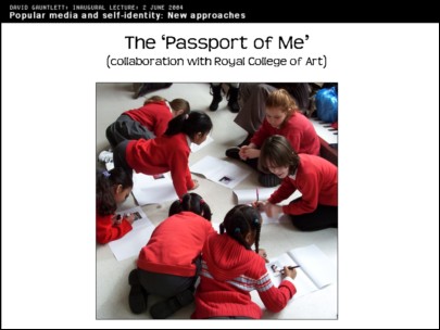
I did a collaboration with Peter Bonnell at the Royal College of Art, where there was this show that was about documentation and documenting things. And they were going to be doing educational workshops and so I suggested that it would be good to have young people creating a document of themselves, which kind of obviously would therefore be a passport. So they made 'The Passport of Me'. They took Polaroid photos of themselves...
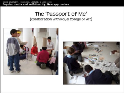
There they are dressing up for the photographs. That wasn't compulsory but they were dressing up there to do the Polaroid photo which goes in the passport. They can also draw on the Polaroid of course, put in different stuff and drawings and things that were important to them. So creating a document of themselves. There they are doing that. There's some collages that they made...
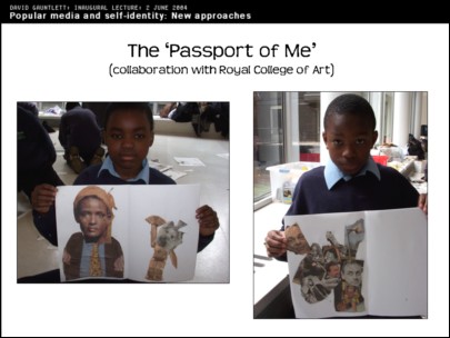
And the young people involved find this a rewarding and interesting thing to do. It's not a piece of 'media' research this, it's more about self and identity. But I find it interesting encouraging people to reflect on that in a visual way.
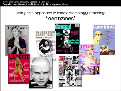
In teaching, here at Bournemouth Media School, we try to use creative and visual methods. This is where, in the module called 'Media, Gender and Identity', students are invited to make their own magazine cover. I can see the creator of one of these works in the room today.
This is a way of thinking through their relationship to men's magazines, women's magazines or other kinds of gendered media. They're asked to make a magazine which reflects their own sense of themselves as a man or a woman and which may also appeal to others. So those are just some 'identizines', as we call them.
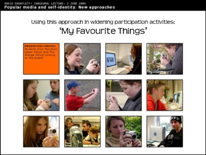
I take no credit for this whatsoever. This is Paul Inman's Widening Participation project called 'My Favourite Things,' in which young people in the area who otherwise would not, or may not, be thinking about Higher Education are encouraged to come in and work with people in the Media School. Here they are taking digital photos of their favourite things, which they then manipulate, and you can see some of the works here:
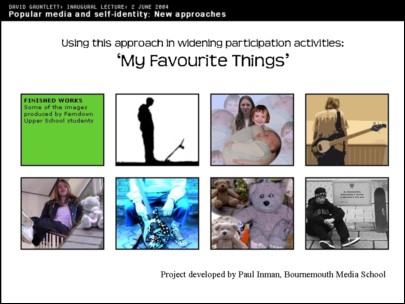
So it's an experience of photography and making images, and it's also an experience of digitally editing those images and putting them together, putting together their favourite things.
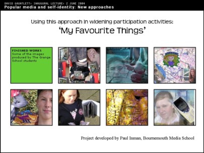
The participants find it rewarding, and they find it thought-provoking, I think, to think through what's special to them and how they can show that, and how they can show it to their friends. It also brings up issues of what you're willing to show to your friends and what's embarrassing, and a certain kind of opening up of personal life.
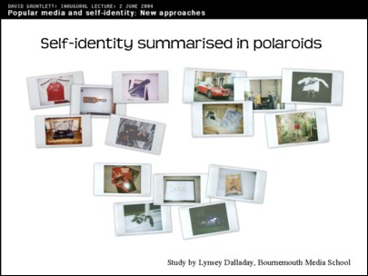
This is a study done by one of my students, Lynsey Dalladay, who did a dissertation about masculinities and she was handing out Polaroid cameras again. She was asking men to take pictures of things that are important to them. There is a surprising amount of beer, cars and sport equipment. I tend to think that could not always be the case these days, but, is, according to this study.
But there were also photographs representing relationships, and family, friends, and travel. Twenty different men took five photographs each, of stuff that was important to them, and Lynsey analysed that and talked to them about it and asked them to tell a story about the photographs.
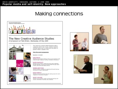
Finally, more or less, I recently organised a symposium, at Tate Britain, for other people doing this kind of research, which is a way of making connections with other people doing things like this. So, for example, we had Sarah Bragg who used a research method where young people were asked to make scrapbooks about stuff they'd seen in the media. It was a study commissioned by a range of public bodies about how young people related to sexual material in the media, and the participants were asked to make scrapbooks pulling together material that they'd seen and things that they'd thought about. And they made quite nice scrapbooks which we were able to see some samples of.
There is my PhD student Ross Horsley, and he's doing a study of men and masculinities where men design their own magazine cover, and contents pages, for magazines that they would like to see about being a man, as opposed to the magazines that you can buy in WHSmiths about being a man.
So that symposium was people using these kinds of visual methods and it seems to, hopefully, be a growing way of doing things. And the idea is to make the Centre for Creative Media Research here at Bournemouth University a hub for such things and this seems to be happening, so that's good.
The nice thing for me about this was that there were people there from MORI, and from Firefish (which is a qualitative research agency), and another public relations research company, and my fear is always that those people use visual methods already. I'm aware of the fact that they use collages, for example. There's very little literature about it. And I thought they were just going to turn up and say 'Oh we do this already, and we've got loads of literature about it here.' And a big door would open up with a massive library of all this stuff that's already been done, which would be rather disturbing and disconcerting.
In fact, it turned out, that wasn't the case. They were interested in what we were doing and they said that basically they did use visual methods already, they had people doing collages and drawings, but they kind of implied that they didn't normally think about it very much and it was a way of filling the time or getting people to put stuff down on paper. Which it is. That's good. But they were interested to see academics thinking through the process more. So that was a considerable relief.
In conclusion, I'll just return to those highlights, briefly: those points that I made before:
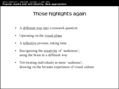
It's a different way into researching media audiences. Not necessarily better but it's a different way in. It operates on the visual plane, like the media does, so that's good. It's a reflective process, different to the instantanity of interviews or whatever. It recognizes people's creativity, uses the brain in a different way, and it's not treating people as mere 'audience' or mere research fodder, because it's hoping to engage with the audience and do something more interesting and creative with them.
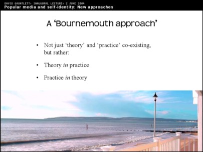
Therefore one would like to summarize this as being 'a Bournemouth approach'. Because what we do aim to do in Bournemouth Media School is not just to have theory and practice sort of co-existing, not really talking to each other. The aim is to bring them together into one thing. Not two things sitting (hopefully happily) side by side, but making them one thing.
So you've got theory in the practice: in the sense that the practical work that the students do, and other things that we make here, is meant to be infused with the theory that we teach, and hopefully that works and it's hopefully becoming more of a fusion as time goes on and we work out new ways of doing it.
And also practice in theory: in other words, when someone like me is theory-building then it's also got the practical element in there because people are doing creative, production things as a central part of it. Which leads directly into the theory that we produce, and it's part of that theory of production process. So the two are united.
It goes without saying
that stuff about this is available on the web.
Thank you very much for listening.
![]()